Net new merchants onboarding
Launching Shopify’s new financial product from scratch
Project overview: Shopify merchants typically receive their sales payouts in their bank accounts within 3-5 business days. However, this delay has been frustrating for many small businesses that need quicker access to funds to sustain their operations.
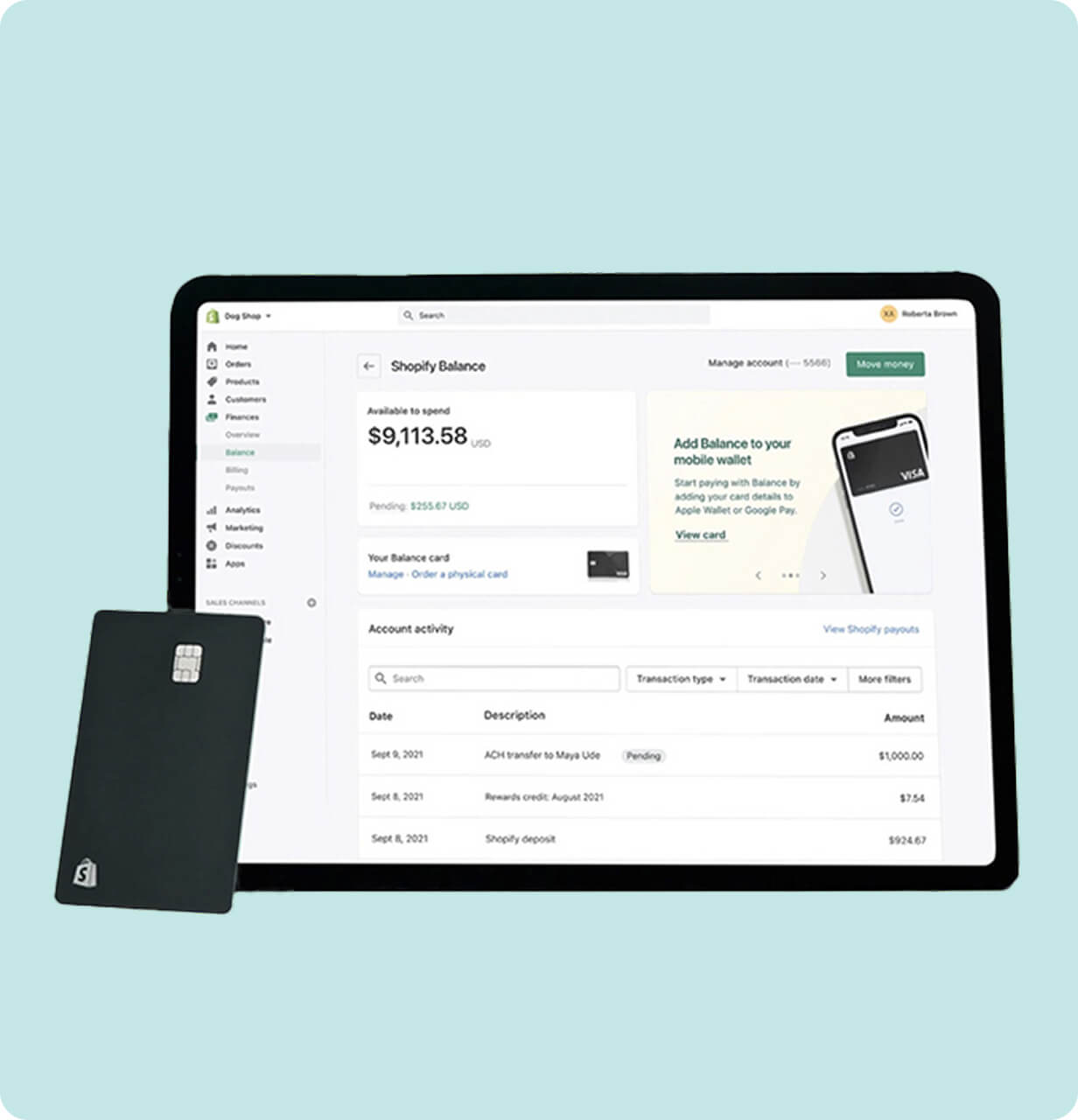
At Shopify, I was part of a small yet ambitious team that designed the pilot launch of Shopify Balance, enabling merchants to receive their sales payouts within 1-2 business days.
Goal: Design an onboarding experience that clearly communicates what Balance is and the benefits, and converts curious merchants into committed users.
Team: Design, Product, Marketing, Content, Engineering, Legal, Risk, and Customer Support
My role: I led the UX/UI design, research, and design strategy.
The challenge
Shopify was launching a brand new product, Shopify Balance, that is a financial account specifically for merchants to manage payout and business funds. Since this product did not exist before, our challenge wasn’t just designing an onboarding flow, it was to introduce, explain, and build trust in something users have never seen before.
Discovery and research
Because this was a beta launch, we had no existing data to work with. Instead, we interviewed merchants to understand their financial pain points, conducted competitive analysis of onboarding flows of banks and fintech competitors, and ran workshops with product, engineering, support, and legal teams.
What we learned:
- Merchants were curious about the new financial product and perks
- Some were curious how Balance was different from Payments (an already existing Shopify product)
- Trust was critical
.png)
Hypothesis
Introducing Balance with a clear and simplified onboarding flow could encourage adoption and build trust.
Streamlining onboarding to drive adoption and trust
My hypothesis was that creating a frictionless onboarding experience would increase sign-ups and product adoption. I focused on designing an onboarding flow with fewer clicks and steps to simplify the experience during account setup.
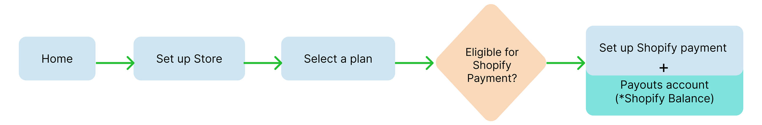
To be eligible for a Shopify Balance account, merchants first needed to have Shopify Payments — the platform’s built-in payment gateway that allows them to accept payments directly through their online store.
Since merchant information was already collected during the Shopify Payments setup, I identified that asking for the same information again during the Balance account setup would lead to redundancy, increased setup time, and unnecessary friction. To streamline the experience, I collaborated with designers from the Payments team, and we integrated the Balance account setup as a step within the existing Payments onboarding flow.
Shopify Balance beta launch
We launched our MVP in beta to a select group of Shopify merchants to validate the product’s core value and gather real user feedback. To support adoption and create awareness, we ran targeted email campaigns introducing Shopify Balance and its key benefits.
What we saw post launch:
- Merchants did not realize what Balance was for
- Some merchants dropped off after seeing the form to fill out their information
- Increase in customer support emails and calls
Reframing the design approach
We went back to drawing board. We had questions:
“Why were merchants hesitating to complete account setup?”
“What were we missing in our design process?”
User research
We reached out to some customers who signed up for Balance to gain insights into their onboarding experience. The research revealed clear opportunities to refine and improve the onboarding flow.
Key insight:
We were asking merchants to do too much too soon without providing enough context or perceived value.
New strategy for next iteration
We redesigned the onboarding journey with education first and prompts to action second.
Key enhancements made to the flow:
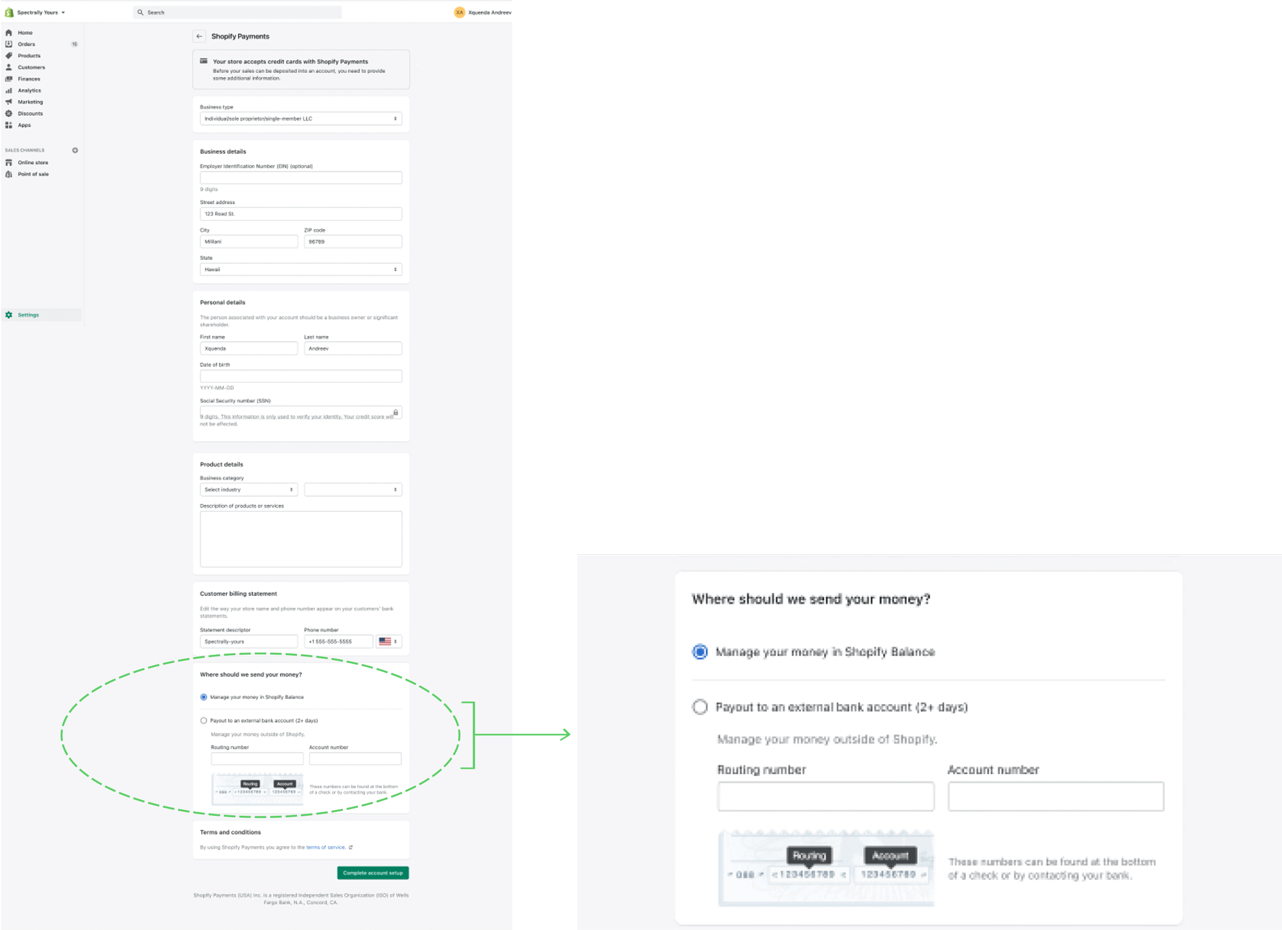
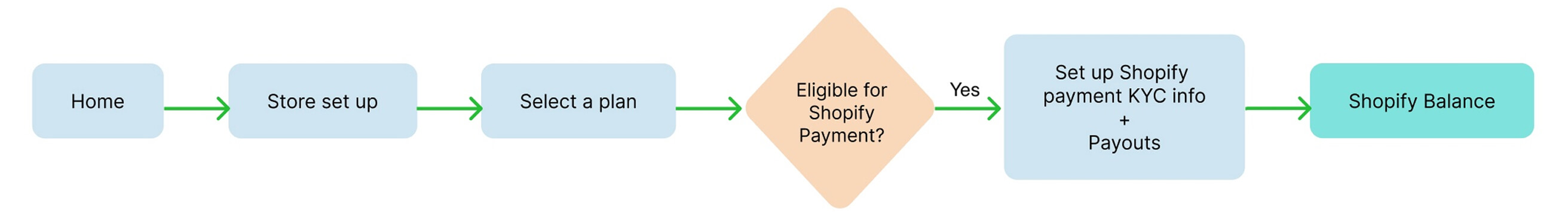
- Separated Balance setup from Payments
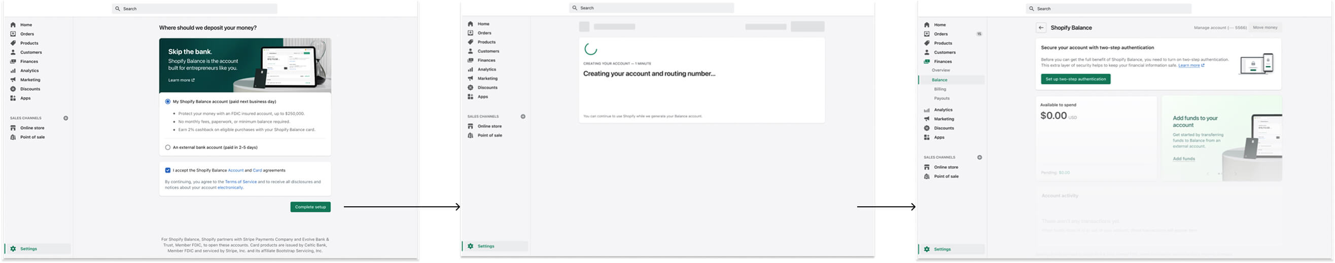
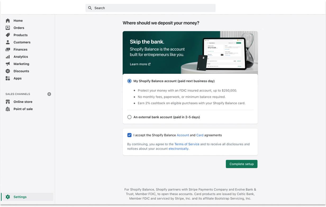
- Added an intro screen with a clear, catchy header 'Skip the bank'
- Used financial terms like 'account and routing number'
- Introduced 'Learn more' link to build trust and clarity
- Included contextual copy and visual support to help decision making
Comparing the new design to the old one
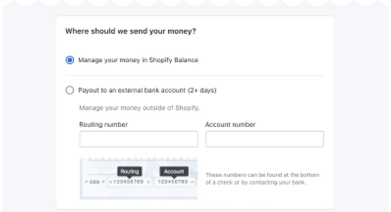
Old design — Balance account setup within payments setup flow
Updated design — Standalone Balance account setup
Approach:
Balance account setup was integrated within the existing Payments setup flow. This design aimed to:
- Reuse merchant information already collected during Payments onboarding
- Reduce the number of steps/clicks required to set up a Balance account
- Accelerate time to onboard to minimize duplication and friction
Approach:
Balance account setup was redesigned as a standalone flow. This design aimed to:
- Educate merchants about what Balance is and how it differs from using an external bank for payouts
- Highlight financial benefits such as faster payouts and lower fees
- Using clear language to frame Balance as a financial business tool
Rationale:
Since Payments is a prerequisite for Balance, this approach aimed to create a seamless, continuous setup by reusing merchant information.
Rationale:
This approach positioned Balance as a core part of merchants’ financial toolkit not an add-on, giving it clarity, purpose, and trust.
Result:
While this approach led to faster onboarding, some merchants missed that they were signing up for another product, as the embedded step lacked sufficient visibility.
Result:
We saw a notable increase in Balance account activations. Merchants' feedback indicated they felt more informed and confident in the product.
A/B test summary — old vs. updated design
We conducted an A/B test of the old design (variant A) and the updated design (variant B) to understand merchant behaviours.
Aspects
Variant A
Variant B
UI
Approach
Balance onboarding embedded within Payments setup flow
Balance onboarding as a separate flow post Payments setup flow
Form optimization
Reused data from Payments to reduce redundancy
Reused data from Payments to maintain efficiency and trust
Time to onboard
Shorter time with fewer steps
Slightly longer time and more touch points
Value communication
Embedded flow lacked context regarding value
Standalone flow had dedicated screen that explained Balance values/benefits
User education
Limited — Balance was introduced within Payments form
Emphasized — design included product overview, value, and a learn more link to help docs
Outcome
Faster flow but lower activation rate due to low comprehension and awareness
Higher activation rate and better user experience
Merchant feedback
"Onboarding felt too easy for a banking product. I didn’t know I was signing up for Balance."
"I wasn’t sure what Balance was, but once I saw how it helped with faster payouts, I signed up."
Outcomes
Our redesign led to substantial improvement in how merchants engaged with Shopify Balance during beta launch.
- Increased onboarding completion and Balance account activation rate
- Clearer understanding of the products value
- Less customer support tickets related to Balance onboarding confusion or drop–off
What we heard:
"Everything was clear and straightforward. I understood the whole setup."
"The sign up experience was unique. No paper work. Nothing felt confusing."
Final designs
The final designs were focused and supportive, guiding merchants through onboarding with clarity and trust.
Reflections
This project taught me that onboarding for a new product has more to do with storytelling. To build trust and drive adoption, you must:
- Use language that users understand with the right tone
- Explain the 'why of the product' before the 'how'
- Sometimes adding a bit of friction, especially in financial onboarding flows, can be a strategic way to build trust and reinforce security
Launching a product in beta is a rare opportunity to create first impressions about a product. By treating onboarding as a narrative and not just form completion, we helped merchants see Shopify Balance as a valuable extension of their business and not just another account setup.