Upgraded branding and intuitive website - DOCS
The goal of this project was to refine the logo and website of a small business, ensuring a professional image that aligns with the brand. The rebranding aimed to reposition the business by creating a cohesive identity.
Professional rebrand - intuitive website
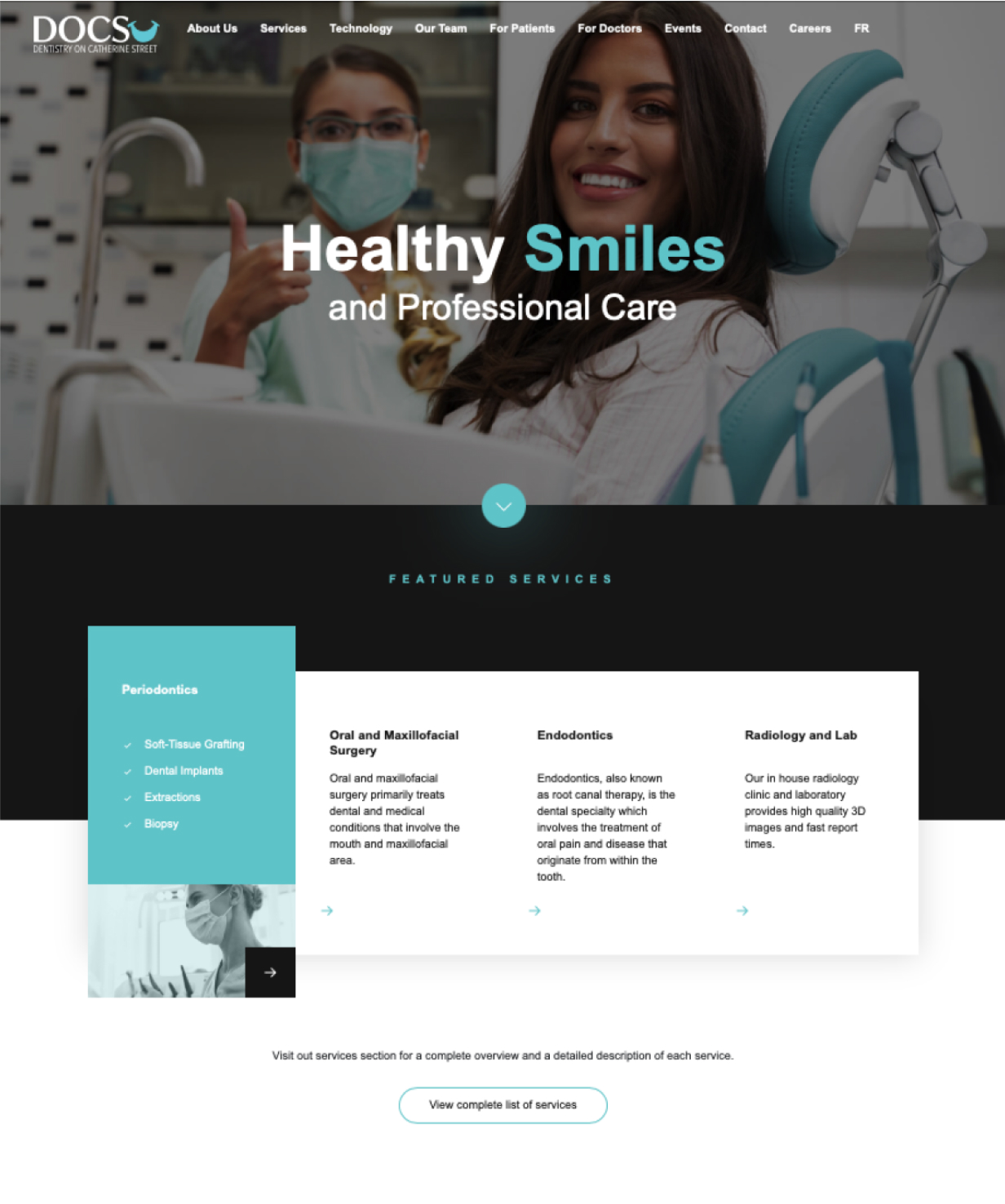
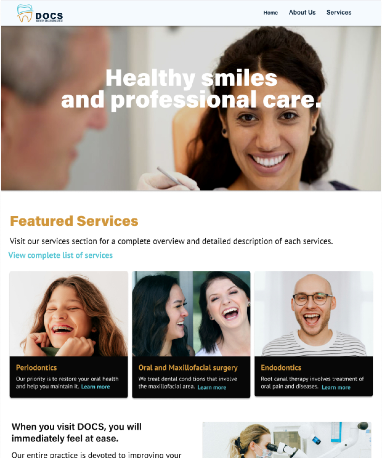
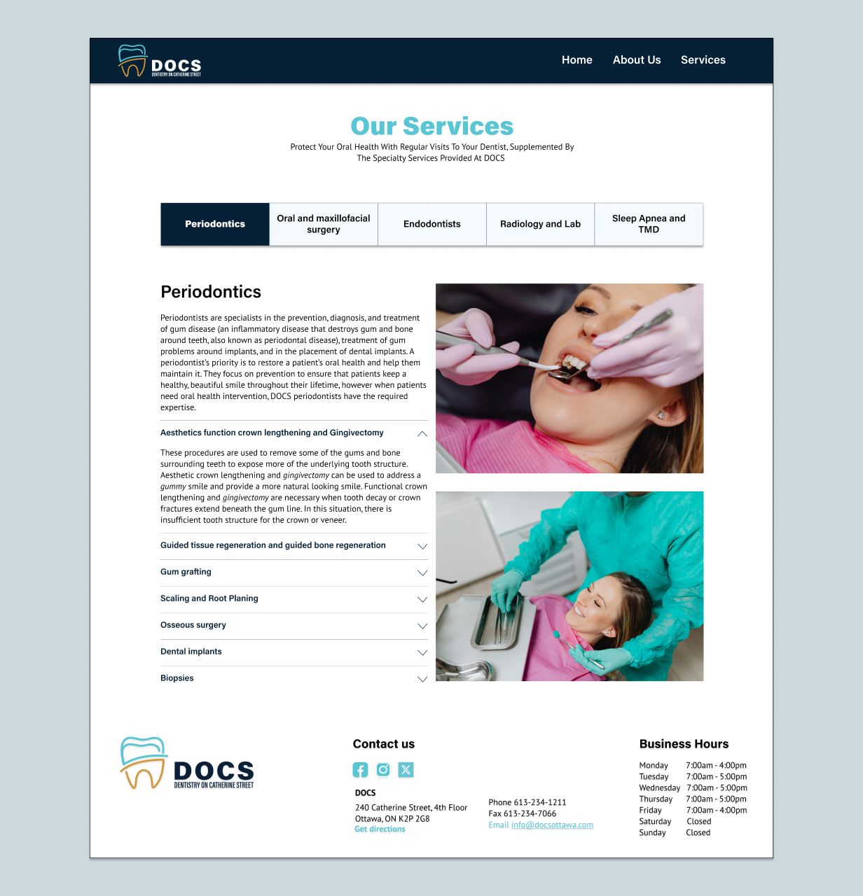
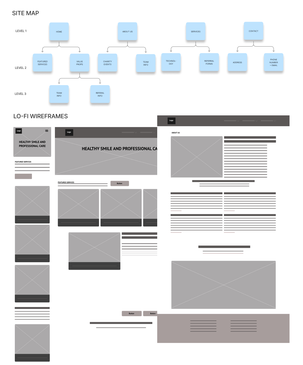
To create an intuitive and modern website, I researched competitors, created a site map, and wireframes for mobile and web mockups on Figma. I conducted user testing and finalized the site’s architecture and accessibility incorporating the feedback. I then built the website in Webflow, ensuring alignment with the new brand identity.
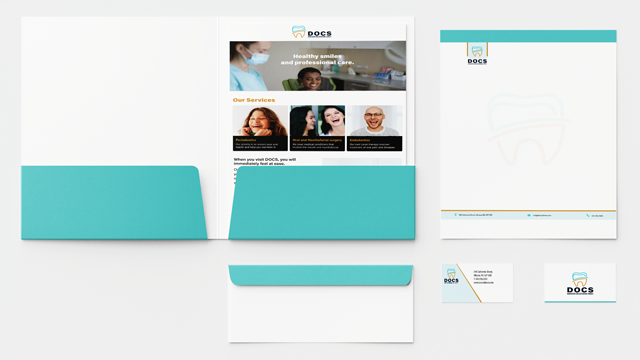
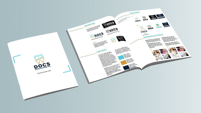
I rebranded the visual identity of DOCS starting with refining the logo to reflect professionalism and creating brand assets, including a brand guideline. After conducting a market analysis and competitive research, I sketched the initial logo concepts and refined them based on client feedback. I collaborated with a design director to refine the colour palette and make it more appropriate for a dental clinic.
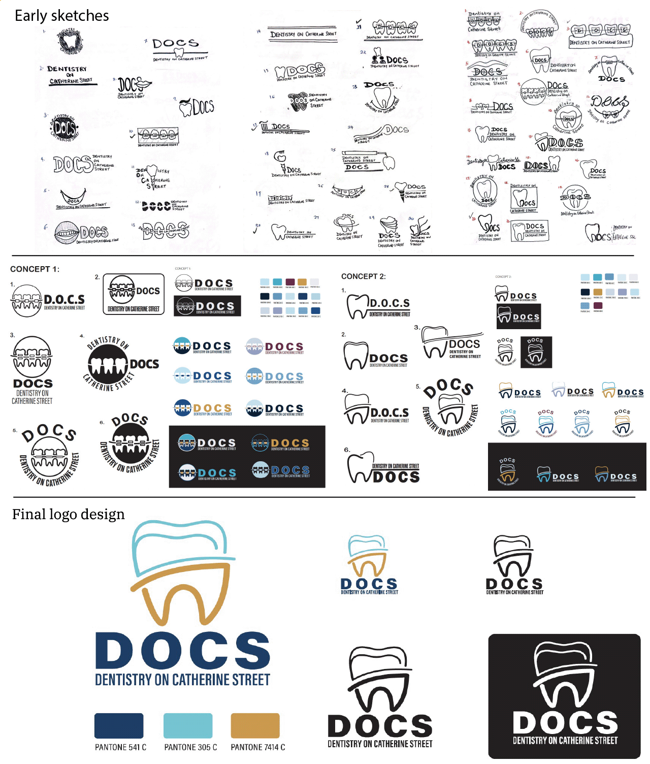
A modern, scalable, and user-friendly brand
The rebranding of DOCS—Dentistry On Catherine Street resulted in a modern, professional, and clean look that reflects the clinic’s expertise. The website is scalable across devices and can be easily managed through custom CMS fields. The client was pleased with the clean, user-friendly design, praising its ease of navigation and readability.
Next steps include incorporating high quality photography and having a content designer redesign the content. This will further enhance the visual identity and strengthen the brand.